- Johnston (typeface)
-
Johnston 
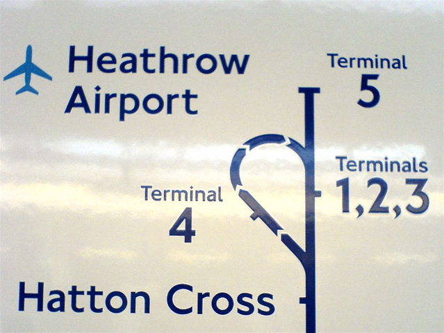
Category Sans-serif Classification Humanist Designer(s) Edward Johnston, Eric Gill Foundry Linotype Date created 1916 Also known as Underground, Johnston's Railway Type  A London Underground map of the Heathrow Airport loop and Terminal 5 stub on the Piccadilly Line with text in the New Johnston typeface
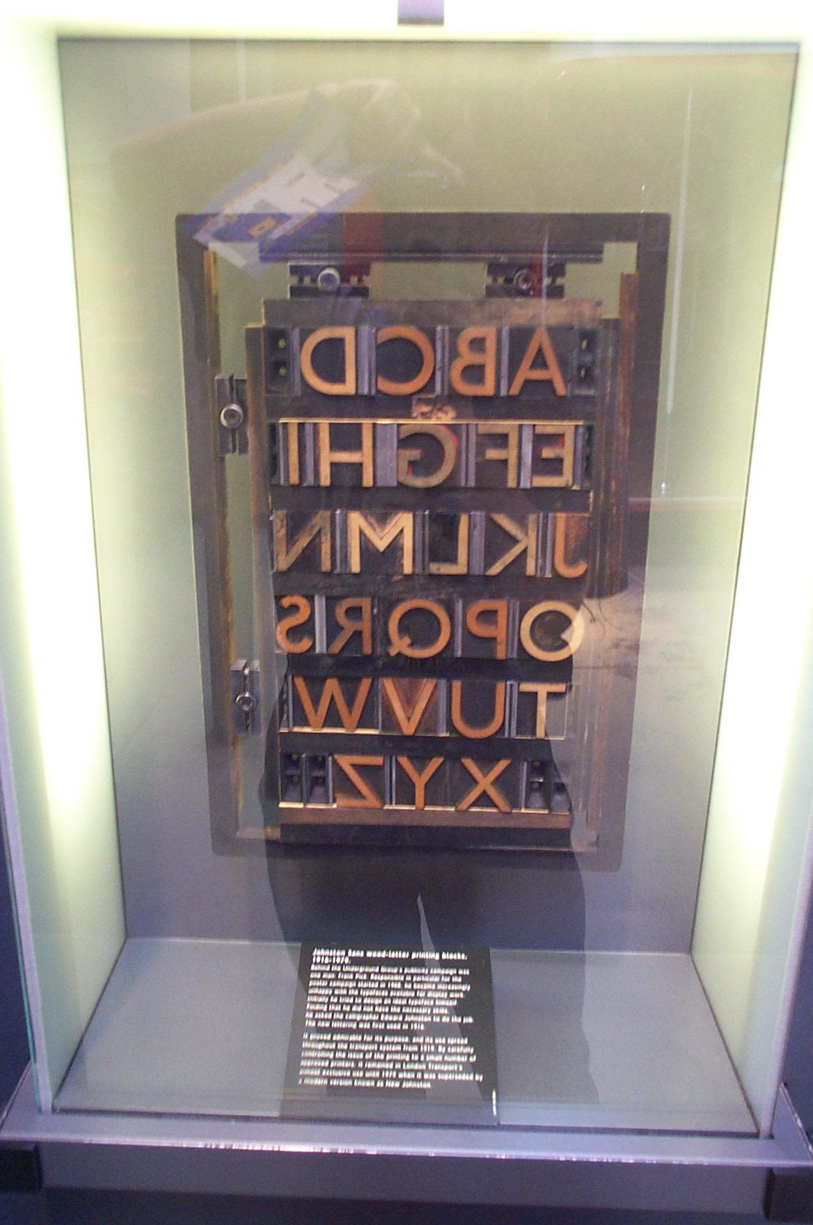
 Johnston printing blocks
Johnston (or Johnston Sans) is a humanist sans-serif typeface designed by and named after Edward Johnston. It is well known for its use by Transport for London.
Johnston's former student Eric Gill also worked on the development of the typeface,[1] which was later to influence his own Gill Sans typeface, produced 1928–32.
Contents
Features
Features of the font are the perfect circle of the letter O and the use of a diagonal square dot above minuscule letters i and j and for the full stop. Commas, apostrophes and other punctuation marks are also based on the diagonal square dot. The capitals of the typeface are based on Roman square capitals, and the lower-case on the humanistic minuscule, the handwriting in use in Italy in the fifteenth century. In this, it marked a break with the kinds of sans serif previously used, sometimes known as grotesque, which tended to have squarer shapes.
History
The typeface was commissioned in 1913 by Frank Pick, Commercial Manager of the Underground Electric Railways Company of London (also known as 'The Underground Group'), as part of his plan to strengthen the company's corporate identity, and introduced in 1916.[2] Pick specified to Johnston that he wanted a typeface that would ensure that the Underground Group's posters would not be mistaken for advertisements; it should have "the bold simplicity of the authentic lettering of the finest periods" and belong "unmistakably to the twentieth century".[3] In 1933, The Underground Group was absorbed by the London Passenger Transport Board and the typeface was adopted as part of the London Transport brand.
The font family was originally called Underground. It became known as Johnston's Railway Type, and later simply Johnston. It comes with two weights, heavy and ordinary. Heavy does not contain lower-case letters.
New Johnston
The Johnston typeface was redesigned in 1979 by Eiichi Kono at Banks & Miles to produce New Johnston, the variant of the original typeface currently used by London Underground. The new typeface is slightly heavier or bolder than the original. The new family comes with Bold, Medium, Light weights. The new typeface replaced the old typeface.
A further change occurred in 2008 when Transport for London removed the serif from the numeral '1' and also altered the '4', in both cases reverting these to their original appearance.
Johnston Delf Smith
The original font was developed in the 1920s by Percy Delf Smith (another former pupil of Edward Johnston). It was commissioned by Frank Pick of London Underground as a 'petit-serif' variation of the organisation's standard sans-serif Johnston face. The typeface was originally used for the headquarters building at 55 Broadway, SW1.
It can still be seen on some signs at Sudbury Town and Arnos Grove on the Piccadilly line.
In early 2007, an electronic version of the typeface was developed under the name Johnston Delf Smith, specifically for use on historic signs.
ITC Johnston
International Typeface Corporation released a variant in 1999 called ITC Johnston, produced by British type designers Richard Dawson and Dave Farey. It originally included three font weights like New Johnston. However, it does not include the hooked 1 and uses side-pointed 4.
In November 2002, the typeface was rereleased in OpenType format, which also expanded the font family to include italic fonts in all weights. Character set was expanded to support ISO Adobe 2 character set. OpenType features include alternates, case forms, small caps (romans only), old style figure. Separate small caps (romans only) and old style figure faces were also released for each weight in TrueType and PostScript formats, for a total of fifteen typefaces.
ITC Johnston Pro
Released in March 2009, this version includes support of Adobe CE character set.
P22 versions
Johnston Underground
In 1997, London Transport Museum licensed the original Johnston typeface exclusively to P22 Type Foundry, available commercially as Johnston Underground. Johnston Underground included Regular, Bold, and Extras weights, with the Extra containing only ornamental symbols.
Underground Pro
P22 later had Paul Hunt add to their version of the Underground typeface to create the Underground Pro (or P22 Underground Pro) family. The full Underground Pro Set contains nineteen Pro OpenType fonts and 58 Basic OpenType fonts, covering extended Latin, Greek, Cyrillic character sets. Weights are expanded to six: Thin, Light, Book, Medium, Demi, Heavy. However, there are no italic styles in P22's designs. Underground, Underground CY, Underground GR support extended Latin, Cyrillic, Greek characters respectively. The Latin sub-family contains medium weight Titling fonts, which feature underscored and/or overscored Latin small letters. Pro fonts include extensive OpenType features, including eleven stylistic sets: Petite Capitals, Dryad Cap Alternates, Humanistic Alternates 1, Humanistic Alternates 2, Geometric Alternates, Round Points, Diamond Points, Alternate Tilde, All Under commas, All cedillas, Alternate Eng.
Usages
Its use has included the Tube map, nameplates and general station signing, as well as much of the printed material issued by the Underground Group and its successors; also by the nationalised British Road Services in the immediate post-war era.
Similar fonts
See also
- Public signage typefaces
- Rail Alphabet - the 1960s British Rail equivalent to Johnston
References
- ^ "Font Designer - Edward Johnston". Linotype GmbH. http://www.linotype.com/733/edwardjohnston.html. Retrieved 2007-11-05.
- ^ Green, Oliver; Rewse-Davies, Jeremy (1995). Designed for London: 150 years of transport design. London: Laurence King. pp. 81–2. ISBN 1-85669-064-4.
- ^ Barman, Christian (1979). The Man Who Built London Transport: A Biography of Frank Pick. David & Charles. p. 43. ISBN 0-71-537753-1.
Further reading
- Howes, Justin (2000). Johnston’s Underground Type. Harrow Weald: Capital Transport. ISBN 1-85414-231-3.
- Banks, Colin (1994). London’s Handwriting: the development of Edward Johnston’s Underground railway block-letter. London Transport Museum. ISBN 185476098X.
External links
- Transport for London - Font requests
- London Transport Museum page on Johnston Sans (via web archive)
- London Transport Museum Photographic Archive
- A Typeface for the Underground, London Reconnections, 18 September 2009
Johnston Delf Smith
New Johnston
- Eiichi Kono, New Johnston from Pen to Printer, Edward Johnston Foundation, 2003.
ITC Johnston
- Identifont page for ITC Johnston
- ITC Johnston Font Family - by Richard Dawson, Dave Farey
- What's Hot From ITC: November 2002
- What's New From ITC: March 2009
P22
Categories:- Government typefaces
- Corporate typefaces
- Humanist sans-serif typefaces
- London Underground
- 1913 introductions
- Transport design in London

Wikimedia Foundation. 2010.