- Tube map
-
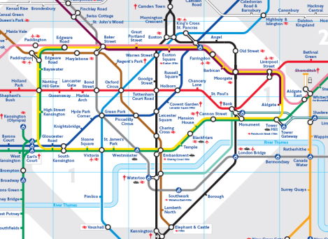
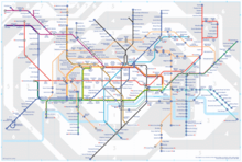 Tube map as of April 2011.
Part of a series of articles on
The Tube

Overview
History
Timeline
Infrastructure
Stations
Trains
Popular Culture
MapThe Tube map is a schematic transit map representing the lines and stations of London's rapid transit railway systems, namely the London Underground (commonly known as the Tube, hence the name), the Docklands Light Railway and London Overground.
As a schematic diagram it shows not necessarily the geographic but rather the relative positions of stations along the lines, stations' connective relations with each other and fare zones. The basic design concepts have been widely adopted for other network maps around the world, especially that of mapping topologically rather than geographically.
Contents
History
Early maps
What is now a single network of lines controlled by a single organisation began as a collection of independent underground railway companies that constructed lines in the 19th and early 20th centuries. These companies published route maps of their own services but did not, generally, co-operate in advertising their services collectively. Early maps were based on standard geographic city maps indicating the directions of lines and locations of station, overlaid on geographic features and main roads.
The first combined map was published in 1908 by the Underground Electric Railways Company of London (UERL) in conjunction with four other underground railway companies using the "Underground" brand as part of a common advertising initiative.[1]
 Tube map of 1908
The map showed eight lines – four operated by the UERL and one from each of the other four companies:
- UERL lines:
- Bakerloo tube - brown
- Hampstead tube - grey
- Piccadilly tube - yellow
- Metropolitan District Railway - green
- Other lines:
- Central London Railway - blue
- City and South London Railway - black
- Great Northern and City Railway - orange
- Metropolitan Railway - red
Being geographically-based presented restrictions in this early map; to enable sufficient clarity of detail in the crowded central area of the map, the extremities of the District and Metropolitan lines were omitted, so a full network diagram was not provided. The problem of truncation remained for nearly half a century. Although all of the western branches of the District and Piccadilly lines were included for the first time in 1933 with Harry Beck's first map, the portion of the Metropolitan line beyond Rickmansworth did not appear until 1938 and the eastern end of the District line did not appear on the map until the mid-1950s.
The route map continued to be developed and was issued in various formats and artistic styles until 1920, when, for the first time, the geographic background detail was omitted in a map designed by MacDonald Gill.[2] This freed the design to enable greater flexibility in the positioning of lines and stations. The routes became more stylised but the arrangement remained, largely, geographic in nature. The 1932 edition was the last geographic map to be published, before the diagrammatic map was introduced.
Beck's maps
 Schematic design of zone 1 of the Tube map. Locations of stations are not geographically accurate.
 Unofficial map of zone 1, showing more correct geographic locations of the stations.
The first diagrammatic map of London's rapid transit network was designed by Harry Beck in 1931.[3] Beck was a London Underground employee who realised that because the railway ran mostly underground, the physical locations of the stations were irrelevant to the traveller wanting to know how to get to one station from another — only the topology of the railway mattered. This approach is similar to that of electrical circuit diagrams; while these were not the inspiration for Beck's maps, his colleagues pointed out the similarities and he once produced a joke map with the stations replaced by electrical circuit symbols and names, with terminology such as "bakelite" for the Bakerloo line.[4]
To this end, Beck devised a simplified map, consisting of stations, straight line segments connecting them, and the River Thames; lines ran only vertically, horizontally, or on 45 degree diagonals. To make the map clearer and to emphasise connections, Beck differentiated between ordinary stations (marked just with tick marks) and interchange stations (marked with diamonds). London Underground was initially sceptical of his proposal — it was an uncommissioned spare-time project, and it was tentatively introduced to the public in a small pamphlet in 1933. It immediately became popular, and the Underground has used topological maps to illustrate the network ever since.
Despite the complexity of making the map, Beck was paid just five guineas for the work.[citation needed] After its initial success, he continued to design the Underground map until 1960, a single (and unpopular) 1939 edition by Hans Scheger being the exception.[5] During this time, as well as accommodating new lines and stations, Beck continually altered the design, for example changing the interchange symbol from a diamond to a circle, as well as altering the line colours - the Central line from orange to red, and the Bakerloo line from red to brown. Beck's final design, in 1960, bears a strong resemblance to the modern-day map. Beck lived in Finchley and one of his maps is still preserved on the southbound platform at Finchley Central station on the Northern line.[6]
After Beck
By 1960, Beck had fallen out with the Underground's publicity officer, Harold Hutchinson. Hutchinson, though not a designer himself, drafted his own version of the Tube map that year. It removed the smoothed corners of Beck's design and created some highly cramped areas (most notably, around Liverpool Street station); in addition, lines were generally less straight.[7] However, Hutchinson also introduced interchange symbols (circles for Underground-only, squares for connections with British Rail) that were black and allowed multiple lines through them, as opposed to Beck who used one circle for each line at an interchange, coloured according to the corresponding line.
In 1964, the design of the map was taken over by Paul Garbutt who, like Beck, had produced a map in his spare time due to his dislike of the Hutchinson design. Garbutt's map restored curves and bends to the diagram, but retained Hutchinson's black interchange circles (the squares however were replaced with circles with a dot inside). Garbutt continued to produce Underground maps for at least another twenty years — Tube maps stopped bearing the designer's name in 1986, by which time the elements of the map bore a very strong resemblance to today's map.[8] Today, the Tube map bears the legend, "This diagram is an evolution of the original design conceived in 1931 by Harry Beck" in the lower right-hand corner.
While the standard Tube map mostly avoided representing mainline rail services, a new variant of the map issued in 1973, the 'London's Railways' map, was the first to depict Tube and surface rail services in a diagrammatic style closely matched to Beck's designs. This version was created by Tim Demuth of the London Transport publicity office and was jointly sponsored by British Rail and London Transport. Demuth's map did not replace the standard Tube map but continued to be published as a supplementary resource, later known as the 'London Connections' map.[9]
Some alterations have been made to the map over the years. More recent designs have incorporated changes to the network, such as the Docklands Light Railway and the extension of the Jubilee line. It also includes major rail lines used for journeys within London, such as London Overground routes, and Tube stops with connections to National Rail services, rail links to airports, and river boats. Stations that can be walked between are now shown, often with the distance between them (this is an evolution of the pedestrian route between Bank and Monument stations, which was once prominently marked on the map). Further, step-free access notations are also incorporated in the map.
In addition, since 2002 the fare zones have been added, to better help passengers judge the cost of a journey. Nevertheless the map remains true to Beck's original scheme, and many other transport systems use schematic maps to represent their services, likely inspired by Beck.
Despite there having been many versions over the years, somehow the perception of many users is that the current map actually is, more or less, Beck's original version from the 1930s — a testament to the effectiveness of his design. Beck did actually draw versions with other formats, 22½ degrees rather than 45 (the Paris Métro version uses 22½ degrees as a base); and an unused version for the 1948 Olympic Games.
One of the major changes to be made to the revision of the Tube map put out in September 2009 was the removal of the River Thames. Although historically the river was not present on several official maps (for example, according to David Leboff and Tim Demuth's book; in 1907, 1908, and 1919), from 1921 it was absent for several years (on pocket maps designed by MacDonald Gill). The Thames-free 2009 version was the first time that the river has not appeared on the Tube map since the Stringemore pocket map of 1926. This latest removal resulted in widespread international media attention,[10][11] and general disapproval from most Londoners as well as from mayor Boris Johnson.[12] Based on this reaction, the following edition of the diagram in December 2009 reinstated both the river and fare zones.
Technical aspects
The designers of the map have tackled a variety of problems in showing information as clearly as possible and have sometimes adopted different solutions.
The font for the map, including station names, is Johnston, which uses perfect circles for the letter 'O'.
Line colours
The table below shows the changing use of colours since Beck's first map. The current colours are taken from Transport for London's colour standards guide,[13] which defines the precise colours from the Pantone palette, and also a colour naming scheme that is particular to TfL. Earlier maps were limited by the number of colours available that could be clearly distinguished in print. Improvements in colour printing technology have reduced this problem and the map has coped with the identification of new lines without great difficulty.
Line TfL colour name[13] Shown as[14] Notes Bakerloo Corporate Brown
Pantone 470brown 1934-present red 1933–1934 brown UERL Central Corporate Red
Pantone 485red 1934-present orange 1933–1934 blue UERL Circle Corporate Yellow
Pantone 116
yellow 1987-presentyellow
(black outline)1949–1987green
(black outline)1948originally part of the Metropolitan and District lines; not shown before 1948 District Corporate Green
Pantone 356green 1933-present green UERL East London Underground Orange
Pantone 137orange
(double stripe) 2010-presentorange 1990–2010 magenta
(double stripe) 1970-c.1990
magenta 1949–1969
green 1937–1948
magenta 1934–1937white
(red outline)1933–1934part of the Metropolitan Line until c.1990; part of London Overground from 2010 Hammersmith & City Underground Pink
Pantone 197pink 1988-present magenta 1949–1988 green 1937–1948 magenta 1934–1937 part of the Metropolitan line until given its own identity in 1988 Jubilee Corporate Grey
Pantone 430grey 1979-present opened 1979; Baker Street to Stanmore section previously part of the Bakerloo line Metropolitan Corporate Magenta
Pantone 235magenta 1948-present green 1937–1948 magenta 1934–1937 red UERL shown combined with the District line 1937–1948 Northern Corporate Black
Pantone Blackblack 1933-present grey (CCE&H) UERL black (C&SL) UERL Northern City none white
(black outline)c.1990–1998orange
(double stripe) 1985-c.1990white
(black outline)1975–1984black
(double stripe) 1970–1975
black 1937–1969white
(black outline)1934–1937white
(magenta outline)1933–1934not shown since 1998; now a Network Rail line orange
(black outline)UERLPiccadilly Corporate Blue
Pantone 072blue 1933-present yellow
(black outline)UERLVictoria Corporate Light Blue
Pantone 299light blue 1968-present opened 1968 Waterloo & City Corporate Turquoise
Pantone 338
turquoise 1994-presentwhite
(black outline)1949–1994red
(black outline)1943–1948white
(black outline)1938–1941thin grey
(main line) UERLnot shown before 1938; part of British Rail until 1994 Docklands Light Railway DLR Turquoise
Pantone 326turquoise
(double stripe) 1993-presentblue
(double stripe) 1987–1993opened 1987 Tramlink Trams Green
Pantone 368green
(double stripe)green
(dotted)not shown on the standard map - see below; both styles used on other maps West London Overground Orange
Pantone 158orange
(double stripe) 2010-nowwhite
(black outline)2007–2010not shown
1943–2007white
(black outline)1938–1941thin grey
(main line) UERLnow part of London Overground North London Overground Orange
Pantone 158orange
(double stripe) 2007-nowwhite
(black outline)c.1990–2007not shown
1985-c.1990white
(black outline)1977–1984thin grey
(main line) UERLnow part of London Overground Watford DC Overground Orange
Pantone 158orange
(double stripe) 2007-nownot shown
1985–2007white
(black outline)1984brown
(triple stripe)1975–1983brown/black/brown
(triple stripe)1973–1974thin grey
(main line) UERLnow part of London Overground; only Queen's Park–Watford shown 1973–1984 (Bakerloo peak hours service) Gospel Oak–Barking Overground Orange
Pantone 158orange
(double stripe) 2007-nowthin grey
(main line) UERLnot shown before 2007 Thameslink none white
(black outline)c.1990–1998orange
(double stripe) 1985-c.1990white
(black outline)1977–1984thin grey
(main line) UERLa Network Rail line; not shown since 1998 A dashed line indicates limited service, under construction or closed for renovation.
Station marks
An important symbol that Beck introduced was the 'tick' mark to indicate stations. This allowed stations to be placed closer together while preserving clarity, because the tick was only on the side of the line nearer the station name (ideally centrally placed, though the arrangement of lines did not always allow this).
From the start, interchange stations were given a special mark to indicate their importance, though its shape has changed over the years. In addition, from 1960, marks were used to identify stations that offered connections with British Railways (now National Rail). The following shapes have been used:
- Circle (one for each line or station, where convenient) - standard default mark
- Circle (one for each station) - 1938 experimental map
- Diamond (one for each line) - early 1930s
- Square - interchange with British Railways, 1960–1964
- Circle with a dot inside - interchange with British Rail, 1964–1970
Since 1970 the map has used the British Rail 'double arrow' beside the station name to indicate mainline interchanges. Where the mainline station has a different name from the Underground station that it connects with, since 1977 this has been shown in a box. The distance between the Tube station and the mainline station is now shown.
Contemporary maps have marked stations offering step-free access suitable for wheelchair users with a blue circle containing a wheelchair symbol in white.
Tube stations with links to airports (Heathrow terminals 1, 2, 3, 4, and 5 for London Heathrow, and the DLR station at London City) are shown with a black aeroplane symbol, and stations with a National Rail link to airports (such as London Stansted via Liverpool Street) are shown with a red aeroplane symbol.
Since 2000, stations with a nearby interchange to river bus piers on the Thames have been marked with a small boat symbol to promote London River Services.
When Eurostar services used Waterloo International, the Eurostar logo was shown next to Waterloo station. On 14 November 2007, these services were transferred to St. Pancras International, and thus King's Cross St. Pancras tube station now bears the text "for St. Pancras International", although it does not show the Eurostar logo.
Some interchanges are more convenient than others and the map designers have often rearranged the layout of the map to try to indicate where the interchanges are more awkward, such as by making the interchange circles further apart and linking them with thin black lines. Sometimes the need for simplicity overrides this goal: the Bakerloo/Northern lines interchange at Charing Cross is not particularly convenient and passengers may be better off changing at Embankment, but the need to simplify the inner-London area means that the map seems to indicate that Charing Cross is the easier interchange.
Lines or services
The Tube map aims to make the complicated network of services easy to understand, but there are occasions when it might be useful to have more information about the services that operate on each line.
The District line is a classic example; it is shown as one line on the map, but comprises services on the main route between Upminster and Ealing/Richmond/Wimbledon; between Edgware Road and Wimbledon; and the High Street Kensington to Kensington Olympia shuttle service. For most of its history the map has not distinguished these services, which could be misleading to an unfamiliar user. More recent maps have tried to tackle this problem by separating the different routes at Earl's Court.
Limited-service routes have sometimes been identified with hatched lines, with some complications added to the map to show where peak-only services ran through to branches, such as that to Chesham on the Metropolitan line. The number of routes with a limited service has declined in recent years as patronage recovered from its early-1980s low point. As there are now fewer restrictions to show, the remaining ones are now mainly indicated in the accompanying text rather than by special line markings.
Official versions of the Tube map
The Tube map exists to help passengers navigate the London rapid transit network and it has been questioned whether it should play a wider role in helping people navigate London itself. The question has been raised as to whether mainline railways should be shown on the map, in particular those in inner-London. The Underground has largely resisted adding additional services to the standard Tube map, instead producing separate maps with different information, including:
- Standard Tube map: Shows all Underground, DLR and Overground lines and stations, and zone boundaries.
- Central London map: A cropped and enlarged version of the standard map showing only the central London area. Some versions show Thameslink and Northern City Line services.
- London Connections map[dead link]: Produced by the Association of Train Operating Companies (ATOC), this provides the same information as TfL's Travelcard Zones map but extends a little further beyond Travelcard Zones 7-9. National Rail lines are emphasised by thicker lines and coloured according to their train operating company (TOC).
- Oyster rail services in London: Issued in January 2010 to coincide with the introduction of Oyster card pay-as-you-go across National Rail services in London,[15][16] this shows Underground, DLR, Tramlink, Overground, National Rail and fare zone boundaries. National Rail lines are shown in white with a thick outline coloured according to the mainline terminus station they serve. This replaces the Travelcard Zones map which had the same content except that National Rail lines were shown in white with a thin black outline.
- High Frequency Services map. The same as the Travelcard Zones map except that lines offering services at greater than 15-minute intervals are de-emphasised so that the more frequent routes can be seen easily.
- Step-free Tube Guide. Underground and DLR only. Indicates stations with full or partial step-free access, and level access suitable for wheelchair users.
- Tube Toilet Map. Underground and DLR only. Indicates stations with toilet facilities.
- Tube Bicycle map. Underground and DLR only. Shows sections of the network where bicycles are permitted in green.
- Real Time Disruption map. Underground, DLR and Overground only. Interactive web-based map with disrupted lines and stations highlighted, others in light grey.
- Interactive journey map. Underground, DLR and Overground only. Interactive web-based map that can be used to access information about each station (e.g. bus connections and disabled access).
Maps are produced in different sizes, the most common being Quad Royal (40 × 50 inches[17]) poster size and Journey Planner pocket size. The maps showing all the National Rail routes provide useful additional information at the expense of considerably increased complexity, as they contain almost 700 stations.
Non-Underground lines on the standard tube map
Some non-Underground lines have appeared on the standard tube map:
- On the early maps which used a geographic background, main line railways were shown as part of the background detail.
- Prior to its transfer to the London Underground in 1994, the Waterloo and City line was operated by British Rail and its mainline predecessors. The line began appearing on most tube maps, from the mid-1930s.
- For a short period in the late 1930s until 1940, the section of the West London Line linking Willesden Junction to the Metropolitan line's Middle Circle route at Uxbridge Road was shown as a service operated by the Great Western Railway and the London, Midland and Scottish Railway. The service was removed when the line closed to passengers in 1940.[5]
- The North London Line was added to the map in 1977.[18] While run by British Rail, and later by Silverlink, it was shown in British Rail/National Rail colours, although its appearance was intermittent, being omitted from some map editions over the years. In November 2007 it was taken over by London Overground and changed to an orange double stripe. The semi-orbital route originally ran from Richmond to Broad Street, then Richmond to North Woolwich; today the line runs from Richmond to Stratford.
- The West London Line, Watford DC Line and Gospel Oak-Barking line (former British Rail/Silverlink lines) were all added to the standard tube map in 2007 when they were taken over by London Overground, and all are shown as an orange double stripe.
- The Northern City Line appeared on the original 1908 map as the Great Northern and City Railway. It later appeared as the Great Northern and City section of the Metropolitan Railway and then, from the late 1930s as part of the Northern Line. The service was transferred to British Rail in 1976 and continued to appear until recently.
- Thameslink reopened in 1988, the line having been closed for many years. It offers some relief to the Northern Line as it connects King's Cross St Pancras to London Bridge. Only the central sections between Kentish Town and London Bridge/Elephant & Castle were shown. Its appearance on Tube maps has been intermittent, having being omitted from some map editions over the years.
- The Docklands Light Railway, the automatic light-rail system in the London Docklands area.
Currently the only non-Underground lines shown are the Docklands Light Railway and the London Overground.
When Transport for London expanded its London Overground service to include the East London Line in 2010, the East London line (extended to Croydon) changed from a solid orange line to a double orange stripe. According to 2007 proposals, the addition of the South London Line to London Overground was due to add the southern loop onto future tube maps in late 2010,[19] but, as of August 2011, this has not yet happened.
Underground lines on geographically accurate maps
Transport for London publish several bus maps that depict the approximate paths of tube routes relative to major streets and London bus routes.[20] These maps also show locations of certain cultural attractions and geographic landmarks.
Spin-offs and imitations
 A London Buses "spider map" on display next to a Tube map at Waterloo Station
The success of the tube map as a piece of information design has led to many imitations of its format. In 2002 Transport for London launched a series of London Buses "spider diagrams" to display at bus stops around the city, conveying bus route information in a schematic style similar to Beck's design,[21] with straight lines and 45° angles depicting geographically distorted bus routes, coloured lines and numbers to differentiate services, and graphical markers to show bus stops. Tube and rail lines are not included, but interchanges are denoted with appropriate symbols by bus stop names, such as the Tube roundel. Unlike the traditional Tube map, the bus maps display services appropriate to specific transport hubs rather than a full network. Each map also contains a central rectangle of a simple, geographically accurate street map to display the positions of bus stops; outside this rectangle, the only geographic feature to appear on the bus maps is the River Thames. These maps are also available for electronic download, with map collections ordered by London borough.[22] The bus maps were designed for TfL by the cartographic design company T-Kartor group.[23]
In 2009, British Waterways produced their own map of London's waterways in a Tube-style diagrammatic map, depicting the River Thames, the various canals and subterranean rivers in the city.[24]
The 'look' of the London Underground map (including 45 degree angles, evenly spaced 'stations', and some geographic distortion) has been emulated by many other subway systems around the world.[25][26] While London Underground have been protective of their copyright they have also allowed their concepts to be shared with other transport operators (Amsterdam's GVB even pays tribute to them on their map).[27]
In June 2011, British Designer Mark Noad unveiled his vision for a more 'geographically accurate' London Underground map.[28] The map is an attempt to see if it is possible to create a geographically-accurate representation of the underground system while still retaining some of the clarity of Beck's original diagram. It uses similar principles, fixed line angles – in this case 30 and 60 degrees instead of 45 – and shortens the extremities of the lines to make it more compact.[29]
Cultural references
 World Metro Map poster sold by London Transport Museum for launch of a book on subway maps entitled 'Metro Maps of the World' in UK
The design has become so widely known that it is now instantly recognisable as representing London. It has been featured on T-shirts, postcards, and other memorabilia. In 2006, the design came second in a televised search for the most well known British design icon.[30] It is widely cited by academics and designers as a 'design classic'[31][32][33][34] and it is due to these cultural associations that London Underground does not usually permit the design to be used or altered for any other purpose.[35] This has only been officially sanctioned on a few occasions:
- David Booth's The Tate Gallery by Tube 1986 is one of a series of publicity posters for the Underground.[36] His work showed the lines of the map squeezed out of tubes of paint and has since been used on the cover of the map itself.
- In 1987, Paul Middlewick 'discovered' that Animals could be created in the Tube map by linking the lines, stations and interchanges. These Animals on the Underground now feature on their own web site.[37]
- In Tate Modern hangs The Great Bear by Simon Patterson, a subtle parody of the contemporary map design, first displayed in 1992, in which the station names on the tube map have been replaced by those of famous figures.
- In 2003, to coincide with the publication of a book about tube maps from all over the world, the London Transport Museum released a "World Metro Map" poster strongly based on the London diagram and approved by TfL.
- Albus Dumbledore, a central character in the Harry Potter series has a scar just above his left knee that is in the shape of a Tube Map.
- In 2006, The Guardian published a design based on the tube map, purporting to show the relationships between musicians and musical genres in the 20th century.[38]
- On 11 January 2007, Lord Adonis unveiled a depiction of the map featuring the names of successful schools and students at GCSE level as part of the London Student Awards 2007.
- The Royal Shakespeare Company produced a map in 2007 linking Shakespearean characters according to their traits in a diagram which resembles the map for complexity.
Stylistic aspects of the London diagram, such as the line colours and styles, the station ticks or interchange symbols, are also frequently used in advertising.
References
- ^ Badsey-Ellis, Antony. London's Lost Tube Schemes. Capital Transport. pp. 282–283. ISBN 1-85414-293-3.
- ^ 1920 map from "A History of the London Tube Maps". http://homepage.ntlworld.com/clivebillson/tube/tube.html. Retrieved 2009-02-07.
- ^ 1933 map from "A History of the London Tube Maps". http://homepage.ntlworld.com/clivebillson/tube/tube.html. Retrieved 2009-02-07.
- ^ Train, Omnibus and Tram Staff Magazine, March 1933 – Garland, Ken. Mr Beck's Underground Map. Capital Transport. p. 25. ISBN 1-85414-168-6.
- ^ a b 1939 map from "A History of the London Tube Maps". http://homepage.ntlworld.com/clivebillson/tube/tube.html. Retrieved 2009-02-07.
- ^ 1960 map from "A History of the London Tube Maps". http://homepage.ntlworld.com/clivebillson/tube/tube.html. Retrieved 2009-02-07.
- ^ 1963 map from "A History of the London Tube Maps". http://homepage.ntlworld.com/clivebillson/tube/tube.html. Retrieved 2009-02-07.
- ^ 1986 map from "A History of the London Tube Maps". http://homepage.ntlworld.com/clivebillson/tube/tube.html. Retrieved 2009-02-07.
- ^ Garland, Ken (1998). Mr Beck's Underground Map. Capital Transport. ISBN 1854141686.
- ^ [1]
- ^ [2]
- ^ New London Tube Map 17 September 2009
- ^ a b "TfL Colour Standards" (PDF). TfL. 2007-03-02. Archived from the original on 2008-02-28. http://web.archive.org/web/20080228103621/http://www.tfl.gov.uk/tfl/corporate/media/designstandards/assets/downloads/tfl/ColourStandardsIssue02.pdf. Retrieved 2008-01-22.
- ^ London Transport Underground Maps; sub-pages are for specific years
- ^ "London Tube Map". London Insider. November 2009. http://www.london-insider.co.uk/complete-london-tube-train-oyster-map-2009-2010/. Retrieved 26 November 2009.
- ^ Barney, Katharine (23 November 2009). "Travel revolution: Oyster rail will cut fares by 30%". London Evening Standard. http://www.thisislondon.co.uk/standard/article-23773539-one-ticket-for-trains-tube-and-buses-in-oyster-card-rail-revolution.do. Retrieved 26 November 2009.
- ^ "Quad royal" definition, London Transport Museum
- ^ 1977 map from "The London Tube Map Archive". http://www.clarksbury.com/cdl/maps.html. Retrieved 2009-02-07.
- ^ Transport for London (2006). "The Tube in 2010". http://www.tfl.gov.uk/resources/corporate/media/pressimages/rez-high/h-tube-map-2010.jpg. Retrieved 2007-11-03. (map illustrating future development phases as proposed by TfL in 2006, subject to change)
- ^ "Central London Bus Map" (PDF). TfL. http://www.tfl.gov.uk/assets/downloads/Central-London-Day-Bus-Map.pdf. Retrieved 2009-02-07.
- ^ Mayor of London. "Transport Strategy - Buses". Archived from the original on 5 October 2007. http://web.archive.org/web/20071005054612/http://www.london.gov.uk/mayor/transport/buses.jsp. Retrieved 2007-11-13.
- ^ "Bus route maps". Transport for London. http://www.tfl.gov.uk/tfl/gettingaround/maps/buses/. Retrieved 14 December 2009.
- ^ "Transport for London". T-Kartor. http://www.t-kartor.com/solutions_tfl. Retrieved 14 December 2009.
- ^ "Tunnel vision: a history of the London tube map". The Guardian. 26 November 2009. http://www.guardian.co.uk/artanddesign/gallery/2009/nov/25/london-tube-map-design?picture=356105646. Retrieved 3 December 2009.
- ^ Underground Railway Maps
- ^ McKie, Robin (7 December 2003). "All right, which bright spark moved Heathrow Airport?". The Guardian (London). http://books.guardian.co.uk/reviews/referenceandlanguages/0,,1101403,00.html. Retrieved 26 May 2010.
- ^ Metro map : GVB
- ^ Samuel, A. (28 June 2011). "Designer gives London Tube map a makeover". http://www.rail.co/2011/06/28/designer-gives-london-tube-map-a-makeover/. Retrieved 1 July 2011.
- ^ Bourner, Tom (28 June 2011). "21st Century Tube Map - Interview with Mark Noad". http://www.lovehatetravel.co.uk/21st-century-tube-map-interview-with-mark-noad/. Retrieved 29 June 2011.
- ^ The Tube Map - The Tube Map - Icons of England
- ^ The London Underground Map - Harry Beck's Design Icon
- ^ London Transport / Designing Modern Britain - Design Museum Exhibition : Design Patron (1933-) - Design/Designer Information
- ^ BBC - h2g2 - Life and Times of the London Underground Map
- ^ Harry Beck and the London Underground Map - The background to the designing of a 'Design Icon' - London Underground Map changing through time but remaining true to Beck's original principle - Designers & Designing - Design & Technology On The Web support resource for students and teachers of Design & Technology at KS3, KS4, A-Level and beyond
- ^ The London Underground anagram map is an example of a parody map which was removed because Transport for London claimed copyright infringement.
- ^ The Tate Gallery by Tube from "The London Tube Map Archive". http://www.clarksbury.com/cdl/maps.html. Retrieved 2009-02-08.
- ^ animalsontheunderground.com
- ^ Lynskey, Dorian (3 February 2006). "Going Underground". Guardian Unlimited (London: The Guardian). http://blogs.guardian.co.uk/culturevulture/archives/2006/02/03/going_underground.html. Retrieved 1 April 2008.
Further reading
- Dow, Andrew, Telling the Passenger where to get off (Capital Transport, London, 2005): ISBN 1-85414-291-7
- Garland, Ken, Mr Beck's Underground Map (Capital Transport, London, 1994): ISBN 1-85414-168-6
- Leboff, David and Demuth, Tim, No Need to Ask! (Capital Transport, London, 1999): ISBN 1-85414-215-1
- Ovenden, Mark, Metro Maps Of The World (Capital Transport, London, 2005): ISBN 1-85414-288-7
- Ovenden, Mark, Transit Maps of the World (Penguin Books, New York, 2007): ISBN 0-14311-265-1
- Roberts, Maxwell, Underground Maps After Beck (Capital Transport, London, 2003): ISBN 1-85414-286-0
- Rose, Douglas, The London Underground: A Diagrammatic History (Capital Transport, London, 2005): ISBN 1-85414-219-4
External links
- Tube maps from TfL
- National Rail maps including London Connections
- Geographically Accurate Tube Map
- Trivia, history and facts on the London Underground Tube map contains more history on the tube map plus alternative designs of the map from Dr Who Conventions, and Simon Patterson's The Great Bear
- Interactive animated journey time map
- www.mylookout.net/maps/londonTube/ - Satellite Image Tube Map uses Google maps to find tube stations by zone and/or lines
- London quickmap mapmovies - all kinds of variations on tube maps
- A history of the London Tube Maps - complete history of the evolution of the map
- London Transport Underground Maps - illustrations of almost every tube map issued
- The London Tube Map Archive has a collection of tube maps, showing the growth of the system and the changes in the style of the map
- Robert Reynolds Subway Page - links and photos of most world subway system maps, many of which use Beck-inspired design principles
- Zoomable Tube and Rail Map
- H2G2 article on the tube map
- Animation showing how today's map morphs into a geographical map and Beck's original map
- Mark Noad's Underground diagram
Categories:- London Underground
- Railway maps of the United Kingdom
- Infographics
- Transport design in London
- UERL lines:


Wikimedia Foundation. 2010.