- Plot (graphics)
-
A plot is a graphical technique for representing a data set, usually as a graph showing the relationship between two or more variables. The plot can be drawn by hand or by a mechanical or electronic plotter. Graphs are a visual representation of the relationship between variables, very useful for humans who can quickly derive an understanding which would not come from lists of values. Graphs can also be used to read off the value of an unknown variable plotted as a function of a known one. Graphs of functions are used in mathematics, the sciences, engineering, technology, finance, and other areas.
Contents
Overview
Plots play an important role in statistics and data analysis. The procedures here can broadly be split into two parts: quantitative and graphical. Quantitative techniques are the set of statistical procedures that yield numeric or tabular output. Examples of quantitative techniques include:[1]
- hypothesis testing
- analysis of variance
- point estimates and confidence intervals
- least squares regression
These and similar techniques are all valuable and are mainstream in terms of classical analysis. There are also many statistical tools generally referred to as graphical techniques. These include:[1]
- scatter plots
- histograms
- probability plots
- residual plots
- box plots, and
- block plots
Graphical procedures such as plots are a short path to gaining insight into a data set in terms of testing assumptions, model selection, model validation, estimator selection, relationship identification, factor effect determination, outlier detection. Statistical graphics give insight into aspects of the underlying structure of the data.[1]
Graphs can also be used to solve some mathematical equations, typically by finding where two plots intersect.
Types of plots
- Arrhenius plot : This plot displays the logarithm of a rate (ln(k), ordinate axis) plotted against inverse temperature (1 / T, abscissa). Arrhenius plots are often used to analyze the effect of temperature on the rates of chemical reactions.
- Biplot : These are a type of graph used in statistics. A biplot allows information on both samples and variables of a data matrix to be displayed graphically. Samples are displayed as points while variables are displayed either as vectors, linear axes or nonlinear trajectories. In the case of categorical variables, category level points may be used to represent the levels of a categorical variable. A generalised biplot displays information on both continuous and categorical variables.
- Bland-Altman plot : In analytical chemistry and biostatistics this plot is a method of data plotting used in analysing the agreement between two different assays. It is identical to a Tukey mean-difference plot, which is what it is still known as in other fields, but was popularised in medical statistics by Bland and Altman.[2][3]
- Bode plots are used in control theory.
- Box plot : In descriptive statistics, a boxplot, also known as a box-and-whisker diagram or plot, is a convenient way of graphically depicting groups of numerical data through their five-number summaries (the smallest observation, lower quartile (Q1), median (Q2), upper quartile (Q3), and largest observation). A boxplot may also indicate which observations, if any, might be considered outliers.
- Dalitz plot : This a scatterplot often used in particle physics to represent the relative frequency of various (kinematically distinct) manners in which the products of certain (otherwise similar) three-body decays may move apart
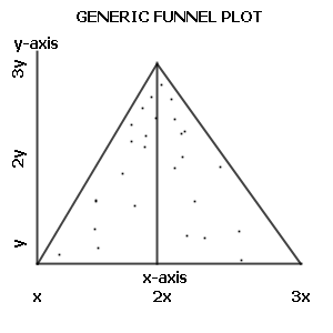
- Funnel plot : This is a useful graph designed to check the existence of publication bias in meta-analyses. Funnel plots, introduced by Light and Pillemer in 1994[4] and discussed in detail by Egger and colleagues,[5] are useful adjuncts to meta-analyses. A funnel plot is a scatterplot of treatment effect against a measure of study size. It is used primarily as a visual aid to detecting bias or systematic heterogeneity.
- Dot plot (bioinformatics) : A dot plot is a graphical method that allows the comparison of two biological sequences and identify regions of close similarity between them. It is a kind of recurrence plot.
- Dot plot (statistics) : A dot chart or dot plot is a statistical chart consisting of group of data points plotted on a simple scale. Dot plots are used for continuous, quantitative, univariate data. Data points may be labelled if there are few of them. Dot plots are one of the simplest plots available, and are suitable for small to moderate sized data sets. They are useful for highlighting clusters and gaps, as well as outliers.
- Forest plot : is a graphical display that shows the strength of the evidence in quantitative scientific studies. It was developed for use in medical research as a means of graphically representing a meta-analysis of the results of randomized controlled trials. In the last twenty years, similar meta-analytical techniques have been applied in observational studies (e.g. environmental epidemiology) and forest plots are often used in presenting the results of such studies also.
- Galbraith plot : In statistics, a Galbraith plot (also known as Galbraith's radial plot or just radial plot), is one way of displaying several estimates of the same quantity that have different standard errors.[6] It can be used to examine heterogeneity in a meta-analysis, as an alternative or supplement to a forest plot.
- Lineweaver–Burk plot : plot is used to represent and determine enzyme kinetics.
- Nichols plot : This is a graph used in signal processing in which the logarithm of the magnitude is plotted against the phase of a frequency response on orthogonal axes.
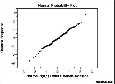
- Normal probability plot : The normal probability plot is a graphical technique for assessing whether or not a data set is approximately normally distributed. The data are plotted against a theoretical normal distribution in such a way that the points should form an approximate straight line. Departures from this straight line indicate departures from normality. The normal probability plot is a special case of the probability plot.
- Nyquist plot : Plot is used in automatic control and signal processing for assessing the stability of a system with feedback. It is represented by a graph in polar coordinates in which the gain and phase of a frequency response are plotted. The plot of these phasor quantities shows the phase as the angle and the magnitude as the distance from the origin.
- Partial regression plot : In applied statistics, a partial regression plot attempts to show the effect of adding an additional variable to the model (given that one or more independent variables are already in the model). Partial regression plots are also referred to as added variable plots, adjusted variable plots, and individual coefficient plots.
- Partial residual plot : In applied statistics, a partial residual plot is a graphical technique that attempts to show the relationship between a given independent variable and the response variable given that other independent variables are also in the model.
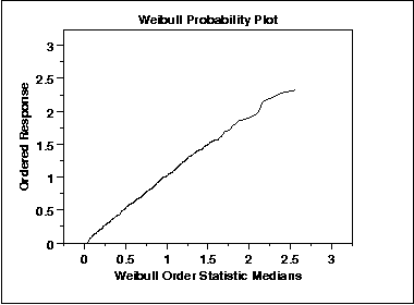
- Probability plot : The probability plot is a graphical technique for assessing whether or not a data set follows a given distribution such as the normal or Weibull, and for visually estimating the location and scale parameters of the chosen distribution. The data are plotted against a theoretical distribution in such a way that the points should form approximately a straight line. Departures from this straight line indicate departures from the specified distribution.
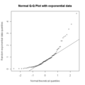
- Q-Q plot : In statistics, a Q-Q plot (Q stands for quantile) is a graphical method for diagnosing differences between the probability distribution of a statistical population from which a random sample has been taken and a comparison distribution. An example of the kind of differences that can be tested for is non-normality of the population distribution.
- Recurrence plot : In descriptive statistics and chaos theory, a recurrence plot (RP) is a plot showing, for a given moment in time, the times at which a phase space. In other words, it is a graph of
- showing i on a horizontal axis and j on a vertical axis, where
 is a phase space trajectory.
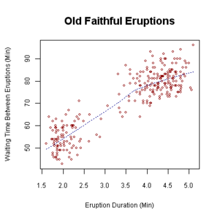
- Scatterplot : A scatter graph or scatter plot is a type of display using variables for a set of data. The data is displayed as a collection of points, each having the value of one variable determining the position on the horizontal axis and the value of the other variable determining the position on the vertical axis.[7]
- Shmoo plot : In electrical engineering, a shmoo plot is a graphical display of the response of a component or system varying over a range of conditions and inputs. Often used to represent the results of the testing of complex electronic systems such as computers, ASICs or microprocessors. The plot usually shows the range of conditions in which the device under test will operate.
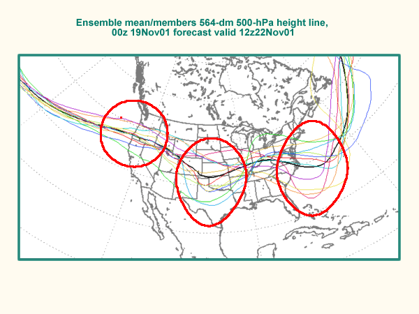
- Spaghetti plots are a method of viewing data to visualize possible flows through systems. Flows depicted in this manner appear like noodles, hence the coining of this term.[8] This method of statistics was first used to track routing through factories. Visualizing flow in this manner can reduce inefficiency within the flow of a system.
- Stemplot : A stemplot (or stem-and-leaf plot), in statistics, is a device for presenting quantitative data in a graphical format, similar to a histogram, to assist in visualizing the shape of a distribution. They evolved from Arthur Bowley's work in the early 1900s, and are useful tools in exploratory data analysis. Unlike histograms, stemplots retain the original data to at least two significant digits, and put the data in order, thereby easing the move to order-based inference and non-parametric statistics.
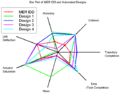
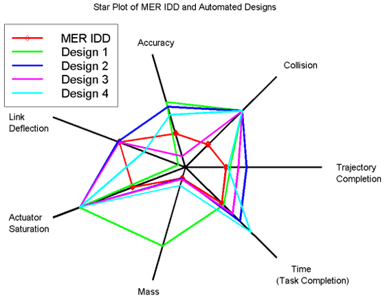
- Star plot : A graphical method of displaying multivariate data. Each star represents a single observation. Typically, star plots are generated in a multi-plot format with many stars on each page and each star representing one observation.
-
A normal Q-Q plot
-
Spaghetti plot
-
Star plot
- Ternary plot A ternary plot, ternary graph, triangle plot, simplex plot, or de Finetti diagram is a barycentric plot on three variables which sum to a constant. It graphically depicts the ratios of the three variables as positions in an equilateral triangle. It is used in petrology, mineralogy, metallurgy, and other physical sciences to show the compositions of systems composed of three species. In population genetics, it is often called a de Finetti diagram. In game theory, it is often called a simplex plot.
- Violin plot : Violin plots are a method of plotting numeric data. They are similar to box plots, except that they also show the probability density of the data at different values (in the simplest case this could be a histogram). Typically violin plots will include a marker for the median of the data and a box indicating the interquartile range, as in standard box plots. Overlaid on this box plot is a kernel density estimation. Violin plots are available as extensions to a number of software packages, including R through the vioplot library, and Stata through the vioplot add-in.[9]
Examples
Types of graphs and their uses vary very widely. A few typical examples are:
- Simple graph: Supply and demand curves, simple graphs used in economics to relate supply and demand to price. The graphs can be used together to determine the economic equilibrium (essentially, to solve an equation).
- Simple graph used for reading values: the bell-shaped normal or Gaussian probability distribution, from which, for example, the probability of a man's height being in a specified range can be derived, given data for the adult male population.
- Very complex graph: the psychrometric chart, relating temperature, pressure, humidity, and other quantities.
- Non-rectangular coordinates: the above all use two-dimensional rectangular coordinates; an example of a graph using polar coordinates, sometimes in three dimensions, is the antenna radiation pattern chart, which represents the power radiated in all directions by an antenna of specified type.
See also
- Graph of a function
- List of graphical methods
- Plotting software
- List of plotting programs
References
 This article incorporates public domain material from websites or documents of the National Institute of Standards and Technology.
- ^ a b c NIST/SEMATECH (2003). "The Role of Graphics". In: e-Handbook of Statistical Methods 6/01/2003 (Date created).
- ^ Altman DG, Bland JM (1983). "Measurement in medicine: the analysis of method comparison studies". Statistician (Blackwell Publishing) 32 (3): 307–317. doi:10.2307/2987937. JSTOR 2987937.
- ^ Bland JM, Altman DG (1986). "Statistical methods for assessing agreement between two methods of clinical measurement". Lancet 1 (8476): 307–10. doi:10.1016/S0140-6736(86)90837-8. PMID 2868172.
- ^ R. J. Light, D. B. Pillemer (1984). Summing up: The Science of Reviewing Research. Cambridge, Massachusetts.: Harvard University Press.
- ^ M. Egger, G. Davey Smith, M. Schneider & C. Minder (September 1997). "Bias in meta-analysis detected by a simple, graphical test". BMJ 315 (7109): 629–624. PMC 2127453. PMID 9310563. http://www.bmj.com/cgi/content/full/315/7109/629.
- ^ Galbraith, Rex (1988). "Graphical display of estimates having differing standard errors". Technometrics (American Society for Quality) 30 (3): 271–281. doi:10.2307/1270081. JSTOR 1270081.
- ^ Utts, Jessica M. Seeing Through Statistics 3rd Edition, Thomson Brooks/Cole, 2005, pp 166-167. ISBN 0-534-39402-7
- ^ Theodore T. Allen (2010). Introduction to Engineering Statistics and Lean Sigma: Statistical Quality Control and Design of Experiments and Systems. Springer. p. 128. ISBN 9781848829992. http://books.google.com/books?id=ev54lAwS2KIC&pg=PA128&dq=spaghetti+diagram+book&hl=en&ei=PPhbTbSDAcXPgAfJhfWVDQ&sa=X&oi=book_result&ct=result&resnum=1&ved=0CEAQ6AEwAA#v=onepage&q=spaghetti%20diagram%20book&f=false. Retrieved 2011-02-17.
- ^ Hintze, Jerry L., and Ray D. Nelson. 1998. "Violin Plots: A Box Plot-Density Trace Synergism." The American Statistician 52(2):181-84.
External links
- Dataplot gallery of some useful graphical techniques at itl.nist.gov.
- Pictovia Chart generator online
Categories:- Plots (graphics)
- Charts


Wikimedia Foundation. 2010.