- Century Type Family
-
Century refers to a family of type faces derived from the original Century Roman cut by American Type Founders’ designer Linn Boyd Benton in 1894. Despite originating in the nineteenth century, use of the typeface remains strong, for periodicals, textbooks, and literature. The faces are noted for their exceptional legibility, so much so that the Supreme Court of the United States requires that briefs be typeset in Century family type.[1]
“The rugged simplicity of the Century family of types has made it an enduring favorite of American typographers for almost one hundred years. Beginning as foundry type, Century has withstood a series of technical transformations into Linotype, Monotype, Ludlow, phototype, transfer type, digital type, and Xerox-like ‘toner type’.” — Charles Bigelow[2]
Contents
Distinctive Visual Identifiable Characteristics
Characteristics of this typeface are:
lower case: square dot over the letter i. double storey a.
upper case: the capital Q's tail is centered under the figure, the uppercase J has a slight hook, and there are two versions of uppercase R, one with a straight tail and one with a curved tail.
figures:
History
Century Roman
Century Roman Category Serif Classification Modern Designer(s) Linn Boyd Benton Commissioned by Theodore Low De Vinne for the Century Magazine Foundry American Type Founders Date created 1894 Date released November, 1895 issue of Century Magazine Theodore Low De Vinne, the greatest printer of his day, and publisher of the Century Magazine, wanted a more legible font for this magazine, and so he commissioned his friend, Linn Boyd Benton from the newly formed American Type Founders, to devise such a face. Over the course of the nineteenth century, largely because of the influence of Bodoni, common printing fonts had become thin, making a weak impression on the page, and not only De Vinne, but the noted aesthete William Morris, had decried this “growing effeminacy” and called for a reversion to blacker faces.[3] The face L.B. Benton produced, Century Roman, had a larger x-height than most faces, thicker hair-lines than was common, and had the proportions of a condensed face, because De Vinne believed this to be more legible.[4] This was made only in foundry type and later an accompanying face of normal width was produced by L.B. Benton, called variously Century Broad Face or Century No. 2.[5]
Century
Century Category Serif Classification Modern Designer(s) Morris Fuller Benton Commissioned by American Type Founders Foundry American Type Founders Date created 1900 Date released 1900 - 1910 Re-issuing foundries Barnhart Brothers & Spindler, Linotype, Intertype, Monotype, Ludlow Design based on Century Roman + Bruce #16 Roman Also known as Century Expanded With the merging of twenty-three foundries into American Type Founders in 1892, Linn Boyd Benton’s son, Morris Fuller Benton, was given the task of consolidating and purging the faces of these manufacturers into a coherent selection. Following this, he was given the task of adapting Century No. 2 to meet the Typographical Union standards of the time. Reccords now in the Smithsonian show that M.F. Benton not only re-designed his father's face, but did so with reference to #16 Roman of the Bruce Type Foundry which A.T.F. had recently acquired. (And which, probably not coincidentally, had been introduced in the Bruce Foundry catalog of 1877 which had been printed by De Vinne.)[6] The result was Century Expanded, which proved hugely successful, so much so that by 1912 the A.T.F. catalog no longer offers the original Century Roman, while displaying 64 pages of samples of other members of the Century family.[7] Following the successful introduction of this type, M.B. Benton embarked upon the creation of the first planned type family, and it is this conception of "type families" that is probably Benton's single greatest achievement. The faces were issued over a period of ten years, all of which were designed by Benton and issued by A.T.F.[8]:
Century series
- Century Expanded (1900)
- Century Italic + Century Bold (1905)
- Century Bold Condensed (1909)
- Century Bold Extended (1910)
Hot Metal Copies
Century proved to be hugely popular and was either licensed or copied by all the makers of mechanical composition machines, including Linotype, Intertype, and Monotype. Barnhart Brothers & Spindler called their version Century Roman, while Ludlow called their 1953 version Century Modern. A few variants were even added[9]:
- Century Bold Condensed Italic (1938, Sol Hess, Monotype)
- Century Extra Bold Extended (Linotype), designed for use in newspaper and magazine headlines.
Cold Type Copies
Century’s popularity and usefulness continued right through the cold type era and was made available for photocomposition by all the leading producers under the following names[10]:
- Century Expanded — Autologic, Berthold, Dymo, Harris, Mergenthaler, Monotype, Varityper.
- Century X — Alphatype
- Century Light — Compugraphic
- Censtar Expanded — Star/Photon
- Cambridge Expanded — Graphic Systems Inc.
- Digi-Antiqua — Hell AG
Digital Copies
A digital version, Benton Modern Text was first prepared by Font Bureau for the Boston Globe and the Detroit Free Press. It was designed by Tobias Frere-Jones and is based on Century Expanded, however, the accompanying italic and bold, are based upon Century Schoolbook Italic + Bold, and were designed by Richard Lipton and Christian Schwartz.[11]
Century Oldstyle
Century Oldstyle Category Serif Classification Old Style Designer(s) Morris Fuller Benton Commissioned by American Type Founders Foundry American Type Founders Date created 1909 Date released 1909 - 1915 Re-issuing foundries Linotype, Intertype, Monotype Design based on Century Roman + Caslon Also known as Old Style No. 9 (Linotype) Century Oldstyle was released at a time when heavier faces with bracketed serifs were returning to vogue. It has little direct relationship to Century Expanded, but it was probably hoped that the success of the earlier face would carry over. The faces were issued over a period of six years, all of which were designed by Benton and issued by A.T.F.[12]:
Century Oldstyle series
- Century Oldstyle + italic + bold (1909)
- Century Oldstyle Bold Italic (1910)
- Century Oldstyle Bold Condensed (1915)
Hot Metal Copies
Century Oldstyle was not as popular as its predecessor, but the roman and italic were copied by Linotype, Intertype, and Monotype.[13]
Cold Type Copies
As oldstyle faces gained in popularity during the photo-comp era, Century Oldstyle was copied more widely then than during the hot type era. Copies were made under following names[14]:
- Century Oldstyle — Alphatype, Berthold, Harris, Mergenthaler
- Cambridge Oldstyle — Graphic Systems Inc.
Century Catalog
Century Catalog Category Serif Classification Modified Old Style Designer(s) Morris Fuller Benton Commissioned by American Type Founders Foundry American Type Founders Date created 1917 Date released 1917 Design based on Century Expanded Century Catalog had a lower x-height than Century Expanded but, despite longer ascenders, adheres to the same general design. Century Catalog Italic is basically a re-working of Baskerville Italic, only the A, V and W being different. Both were designed by M.F. Benton and released by A.T.F. in 1917.[15]
Copies
As far as is known, Century Catalog was never copied by other foundries, for machine composition, or as cold type. Digital versions may exist.
Century Schoolbook
Century Schoolbook 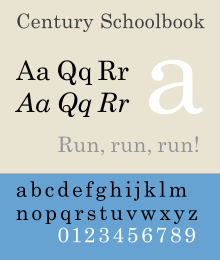
Category Serif Classification Transitional Designer(s) Morris Fuller Benton Commissioned by Ginn & Company Foundry American Type Founders Date created 1918 Date released 1918 - 1923 Re-issuing foundries Linotype, Intertype, Monotype, Ludlow Design based on Century Expanded Also known as Century Modern (Ludlow) Century Schoolbook is a Transitional classification serif typeface designed by Morris Fuller Benton in 1919 for the American Type Founders (ATF) at the request of Ginn & Co., a textbook publisher, who were looking for an especially easy-to-read face for textbooks. It is classified as old style, but the Schoolbook variation has elements similar to the Didone classification. Century Schoolbook is based on the earlier Century Roman.
Century Schoolbook is familiar to many in North America as being the typeface many first learned to read with. Morris Fuller Benton utilized research done by Clark University that showed young readers more quickly identified letterforms with contrasting weight, but with the lighter strokes maintaining presence. Tests also showed the importance of maintaining counter-form (the white space around the black letterform) in recognizing the face at smaller sizes.[16] In designing Century Schoolbook, M. F. Benton increased the x-height, the stroke width, and overall letterspacing. The faces were issued over a period of five years, all of which were designed by Benton and issued by A.T.F.[17]:
Century Schoolbook series
- Century Schoolbook (1918)
- Century Schoolbook Italic (1921)
- Century Schoolbook Bold (1923)
Schoolbook Oldstyle
A final member of the family was an oldstyle version called Schoolbook Oldstyle begun in 1920 and released in 1926, an italic following in 1928. This face never achieved anything like the popularity of its sister faces, was never adapted for machine composition (much less cold type or digital) and was eventually withdrawn.
Hot Metal Copies
Another immensely popular face for A.T.F. and Benton, Century Schoolbook was either licensed or copied by all the makers of mechanical composition machines, including Linotype, Intertype, Monotype, and Ludlow. One variant, Century Schoolbook Bold Italic was even added by Intertype.[18]
Cold Type Copies
The popularity of Century Schoolbook outstripped that of Century in the cold type era, and it was offered by all manufacturers under the following names[19]:
- Century Schoolbook — Autologic, Berthold, Dymo, Harris, Mergenthaler, Monotype, MGD Graphic Systems.
- Century Text — Alphatype
- Century Textbook — Compugraphic
- Censtar School — Star/Photon
- Cambridge Schoolbook — Graphic Systems Inc.
- Schoolbook — Varityper
Soviet Schoolbook
A cyrillic version of Century Schoolbook (called Shkolnaya or "School") was originated in 1939 by group of designers directed by Evgeny Chernevsky. However, the design was completed only in 1949–61 at Polygraphmash type design bureau, by a design group headed by Elena Tsaregorodsteva, the leading member of the 1939 Chernevsky team.[20]
Digital Copies
New Century Schoolbook is a version developed by David Berlow for Linotype.[21] There are also versions by URW++, DTP Types, Monotype, Bitstream, Elsner+Flake.[22]
Digital Variants
Grad is a variant by Mark Simonson based on the original ATF Century Schoolbook. Augustea BQ is Berthold's version.[23]
Century Schoolbook Infant

This is a single-story version of the typeface used to help children learn to read. It is very rare, but it can be found in the Spot books by Eric Hill.
Century Nova
Century Nova Category Serif Classification Modern Designer(s) Charles E. Hughes Commissioned by American Type Founders Foundry American Type Founders Date created 1964 Date released 1964 Design based on Century Expanded Century Nova + Italic was designed by Charles E. Hughes with the stipulation from A.T.F. that it must be equally suited for both letterpress (hot type) and offset (cold type) reproduction.[24] The thin lines are substantial and the lower-case letters have a larger x-height, and (perhaps ironically) it returns to the condensed nature of the original Century Roman.[25] This was the second-to-last face cut by A.T.F..
See also
- Typefaces category
- List of typefaces
References
- ^ SUPREME COURT OF THE U.S. - RULES
- ^ Shaw, Paul, The Century Family in Fine Print on Type, edited by Charles Bigelow, Paul Hayden Duensing, and Linea Genry, Bedford Arts, San Francisco, 1989, ISBN 0-9607290-1-1, pp. 46 - 49.
- ^ Shaw, The Century Family, pp. 46 - 49.
- ^ De Vinne, Theodore Low, The Practice of Typography, Plain Printing Types, The Century Co., N.Y.C., 1902, p. 359.
- ^ MacGrew, Mac, "American Metal Typefaces of the Twentieth Century," Oak Knoll Books, New Castle Delaware, 1993, ISBN 0-938768-34-4, pp. 76 - 81.
- ^ Shaw, The Century Family, p. 46.
- ^ American Specimen Book of Type Styles, American Type Founders Company, Elizabeth, N.J., 1912.
- ^ MacGrew, Mac, American Metal Typefaces of the Twentieth Century, pp. 76 - 81.
- ^ MacGrew, Mac, American Metal Typefaces of the Twentieth Century, pp. 76 - 81.
- ^ Lawson, Alexander, Archie Provan, and Frank Romano, Primer Metal Typeface Identification, National Composition Association, Arlington, Virginia, 1976, pp. 34 - 35.
- ^ New Fonts: Benton Modern Display, Rocky & ITC Franklin
- ^ MacGrew, Mac, American Metal Typefaces of the Twentieth Century, pp. 76 - 81.
- ^ MacGrew, Mac, American Metal Typefaces of the Twentieth Century, pp. 76 - 81.
- ^ Lawson, Provan, and Romano, Primer Metal Typeface Identification, pp. 34 - 35.
- ^ MacGrew, Mac, American Metal Typefaces of the Twentieth Century, pp. 76 - 81.
- ^ Shaw, The Century Family, pp. 46 - 49.
- ^ MacGrew, Mac, American Metal Typefaces of the Twentieth Century, pp. 76 - 81.
- ^ MacGrew, Mac, American Metal Typefaces of the Twentieth Century, pp. 76 - 81.
- ^ Lawson, Provan, and Romano, Primer Metal Typeface Identification, pp. 34 - 35.
- ^ Typography During WWII
- ^ Century Schoolbook|ITC Century|New Century Schoolbook
- ^ Identifont
- ^ Identifont
- ^ "Century Nova, New Typeface, Shown at Premiere in Milwaukee," Inland Printer, November 1965, p. 176.
- ^ Jaspert, W. Pincus, W. Turner Berry and A.F. Johnson. The Encyclopedia of Type Faces. Blandford Press Lts.: 1953, 1983. ISBN 0-7137-1347-X, p.43.
- Meggs, Philip and Rob Carter. Typographic Specimens: The Great Typefaces. Van Nostrand Reinhold: 1993. ISBN 0-442-00758-2
- Meggs, Philip B. and Roy McKelvey. Revival of the Fittest. RC Publications, Inc.: 2000. ISBN 1-883915-08-2
External links
Categories:- Transitional serif typefaces
- American Type Founders typefaces
- Corporate typefaces
- Newspaper and magazine typefaces
- Typefaces with infant variants
- Letterpress typefaces
- Photocomposition typefaces
- Virtual typefaces

Wikimedia Foundation. 2010.